


How To Better Design Vintage Polo Shirts In 8 Steps.
Designing for polo shirts is different than designing for T-shirts. People who wear polos are different from people who wear print T-shirts. A lot different. People who wear polo shirts like a rich sporty look with numbers, badges and high society symbols.
In this article I describe how we design vintage polo shirts but that’s not necessarily the workflow that’s best for you.
[activecampaign form=15]
Advertisement
Concept Creation
The client is coming in with the new material of his competitors found on the internet or in brochures. He also brings the new color samples for the next season provided by different fashion and trend watchers. Together with the client we examine them and decide on a direction for our polo shirts.
We are not copying designs and you should never do that to but get inspired by what is going on and hooking into that is what makes a business do well.

Finding the Right Type
We start by finding the right typeface for the theme we decided on. In this case, Vintage Athletic Sports.
We type a couple of words that fit the concept in the Quick Type section of Suitcase Fusion and go thru the font library. This way we instantly see what font face works good with the concept.
When we’ve found a font that we like and it fits the concept, we activate it and create a new Adobe Illustrator file. We write or past that line of text in, hit return and past it again for about 8 times. We give the first text line the just activated type face.
We go back to Suitcase and find another suitable type and repeat the process until we have 5 to 8 suitable type faces lined up in Adobe Illustrator.

Terminology
Now we are going to find more words that fits the concept so we can make a couple of rich looking badge designs. On our .ai sketch canvas we type every word that has anything to do with our concept.
When you design vintage polo shirts, don’t forget to put numbers and dates in there. They always work well in badge designs. We are working with fashion to so find some words that fit that to.


Advertisement
Shirt Layout
Our badge and print designs are finished for now. The next step is to place them onto the polo shirt. What combination of badges are we going to use? Will the end product be 2 different designs? When we design vintage polo shirts we often go for a very rich and a not so rich design.
We start with our polos in about 13 colors and our designs in white. We make the badge and print color choices next.

Coloring
Now we have an overview of all the color shirts and we simply just start coloring the artwork and find out what looks good. We make al kins of combinations. Making duplicates of a particular colored shirt and trying multiple options makes it clear witch ones are good. The client gets 13 sheets with proposals – for each shirt color one sheet – and picks one or two per color.
Not all of the 13 different color shirts go into production. The client makes the final choice at the very end. Sometimes at the manufacturer just before production. Designing vintage polo shirts is a collaboration between you and your client. Your client knows the market better than you.

Choosing Material
During the badge design process it becomes clear what part would be screen printed, stitched and embroidered. What kind of fabric to use for the applications and how to stitch them onto the shirt. Does the stitch reach over the edge or do we keep it away from the edge so it get frayed when washed.
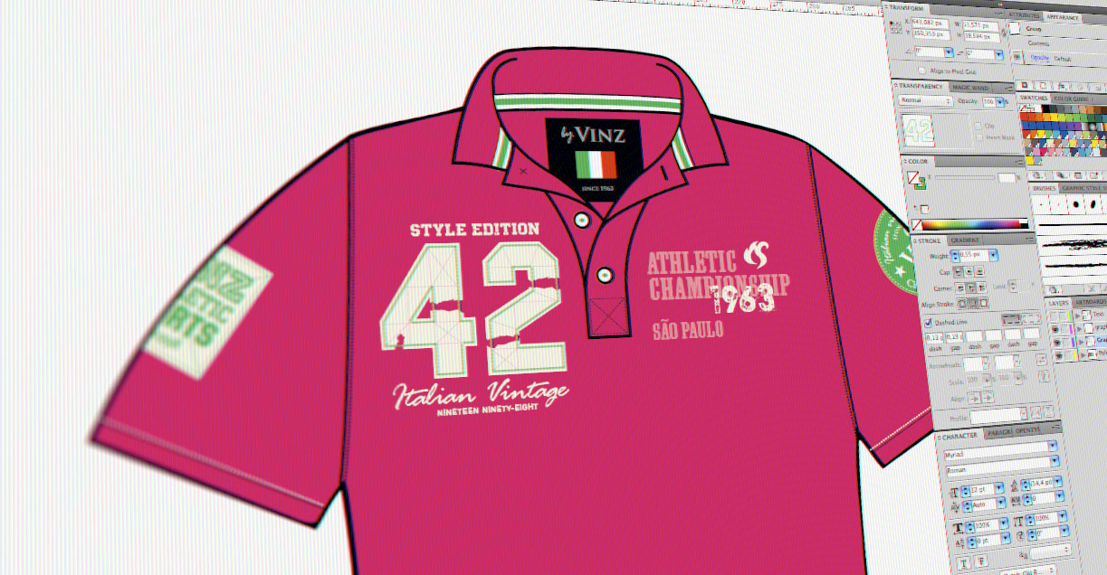
In the case of the number we chose for the fabric to be fleece and to have an extreme worn look by making wholes in it in advance and stitching it away from the border. The text above and under the 42 is going to be embroidered and the small text at the bottom screen printed.
The badges on the sleeves are going to be fleece with embroidery and the left chest is going to be screen printed in two colors.
Now we have created a very rich and vintage looking polo shirt.

Finalizing Design
For our design to go into production a couple of things have to be done. The badge designs have to be at a 100% of the actual shirt size and we have to indicate all the parts for embroidery, screen printing and sewing. The files must also be handled by the manufacturer. In our case pdf’s are the best fit for every party involved.
The client is off to the manufacturer with the pdf’s, the color samples and the fabric samples and in a view months he’s selling his vintage polo shirts to many happy customers.
This is how we design vintage polo shirts!

Are you ready to Design Vintage Polo Shirts ?
Have you ever thought about offering your clients a design for (work) clothing? Ask them if they’re thinking about sponsoring an athlete in an upcoming event and tell them you can design the clothing. Maybe they go and play squash every friday with the office team or go on a field trip.
These are just some ideas to help your clients establish their brand and for you to get more work.
Tell me what you thing in the comments below and you’ll receive a nice present by email.
[activecampaign form=13]
Advertisement


